Brabants Dal Advocaten

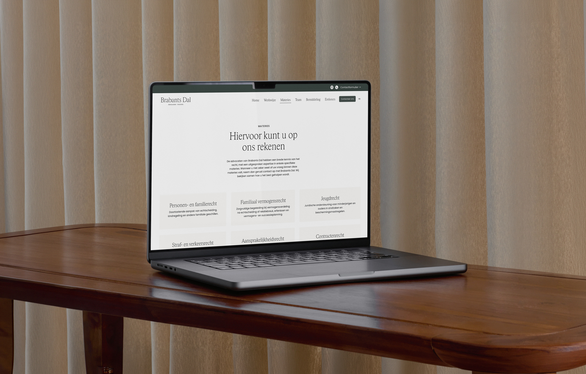
Brabants Dal Advocaten knew what they wanted to convey: a firm that truly stands by its clients, with clear communication and an approach that brings calm. What was missing was a visual and verbal language that told that story just as powerfully as the lawyers themselves. They came to Studio Conquesta looking for a brand identity that feels both professional and human, works bilingually and holds up from the inside out.
Together we built an identity that is strong at its core and clear in its approach. That started with strategy: brand values, tone of voice and a verbal identity that translates legal expertise into accessible, direct language. Visually we chose a calm colour palette in warm white and deep green, a classic serif typeface with contemporary lines and a logo that radiates calm and balance. We then translated that identity consistently across all expressions, from internal print materials to external communications, so that every client of Brabants Dal immediately knows where they stand.